+3.5
Average self-reported state shift across four dimensions · n=4
 Portfolio
A four-mode mobile tool that helps users regain clarity in the final minutes before a presentation, interview, or high-stakes meeting — built for the moment when cognitive capacity is already reduced.
Existing wellness apps assume you have time and headspace. The three minutes before performing, you have neither.
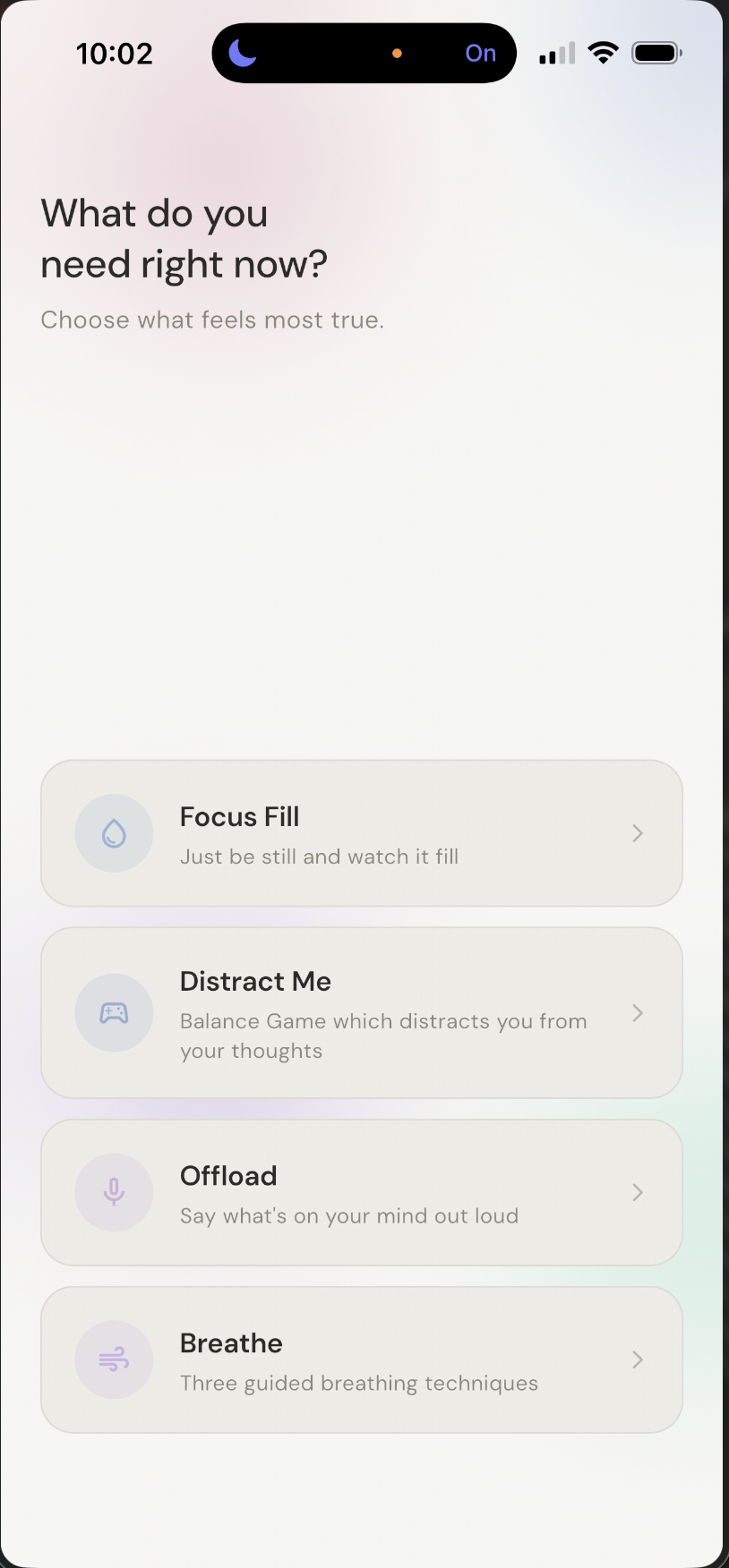
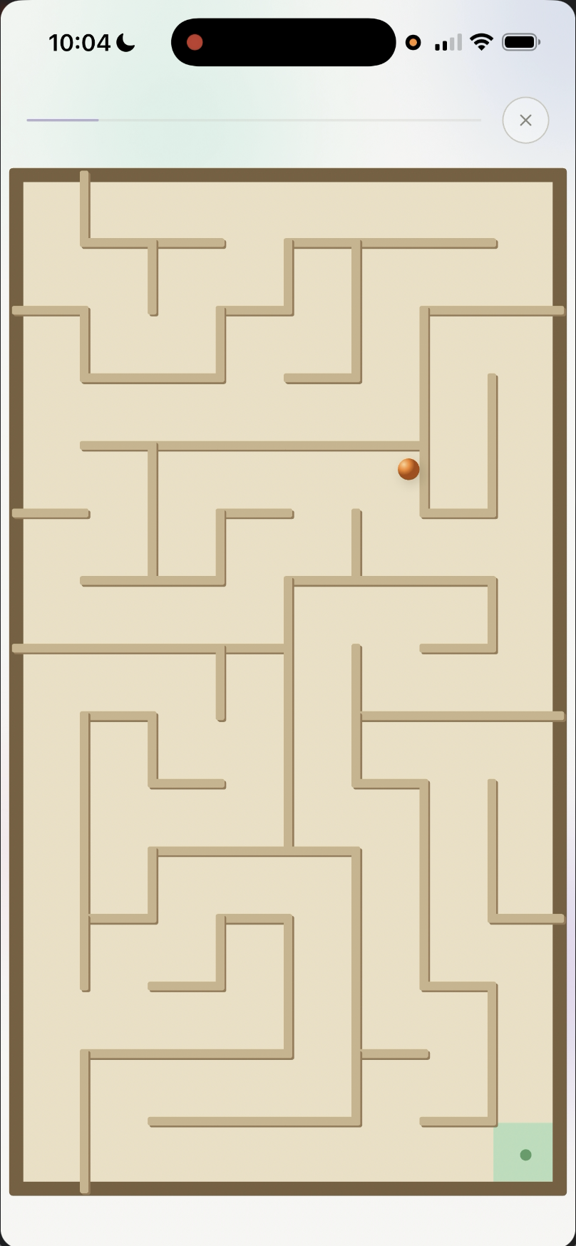
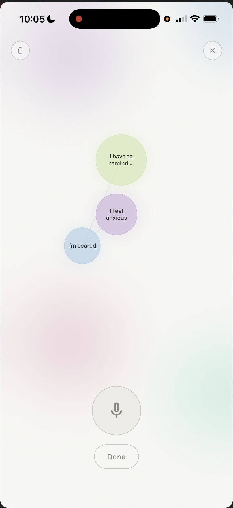
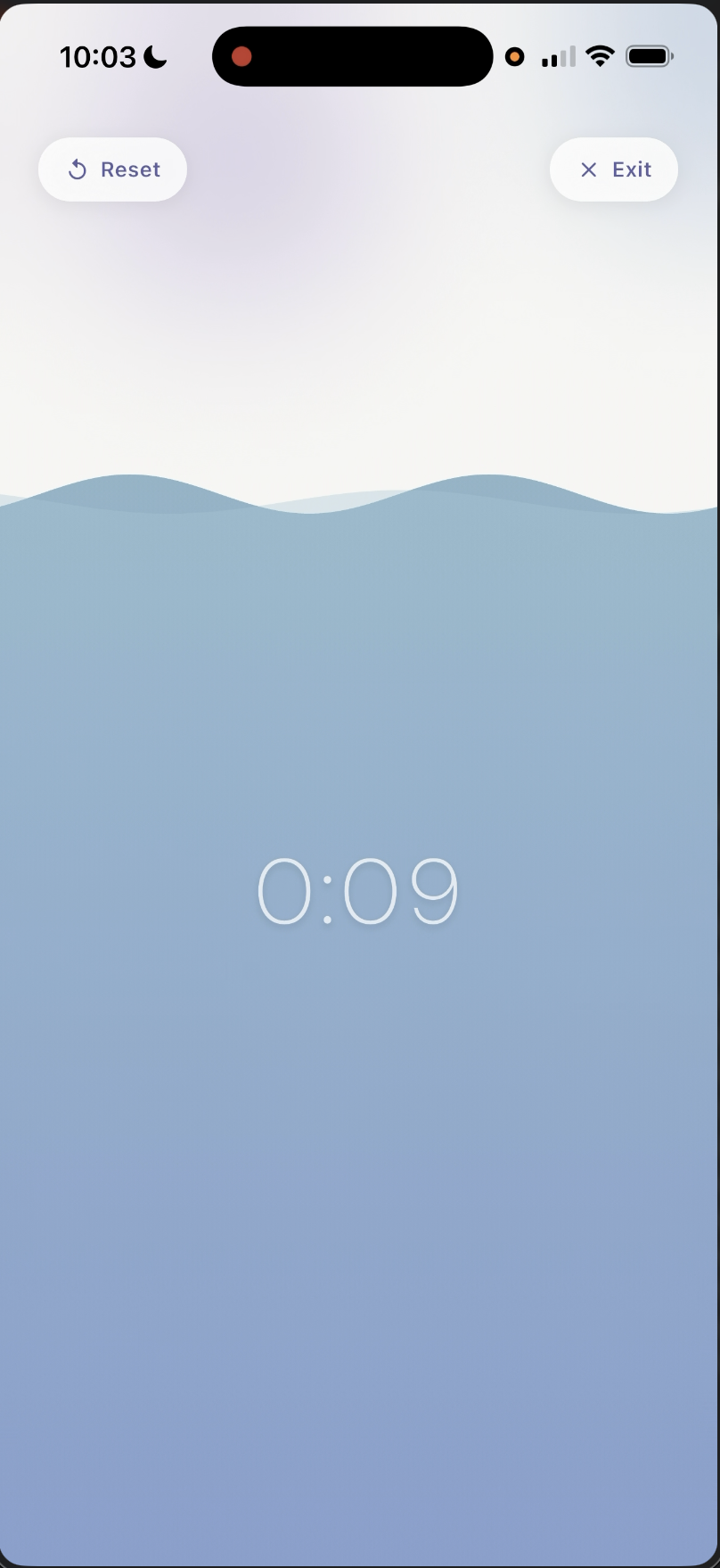
4 modes, one home screen. The user chooses what they need right now, then lands in one dominant interaction with a visible exit.
The final minutes before performing are a specific interaction problem, not a wellness problem. — Project reframe
Users need support precisely when their ability to think clearly is reduced. Meditation apps, long onboarding flows, and general wellness framing miss that three-minute window.
Do not try to cure nervousness. Design for the window where cognitive capacity is already reduced. — Design principle
I don't need a full solution. I just need something that helps me stop spiralling right before I begin.
Right before something important, I don't want advice. I just want to feel steady and focused.
5 semi-structured interviews with postgraduate students, aged 23–30, led to affinity mapping, three How Might We statements, co-design, low-fi testing, and a Flutter prototype.
| Decision | Driven by |
|---|---|
| Multiple support modes, not one universal flow | Participants described different stress responses: active vs passive, mental vs physical. |
| Add breathing as a fourth mode | Secondary research showed breathing as the strongest acute-stress intervention; co-design alone would have missed it. |
| Reframe from grounding companion to pre-performance tool | The 3-minute constraint stopped the concept drifting into general wellness. |
| Make low-fi visually clearer than typical wireframes | The concept depends on emotional tone. Pure wireframes could not show whether it felt calm. |
| Build mid-fi in Flutter, not Figma | Breathing, balancing, and microphone offloading needed real interaction to evaluate. |
Five semi-structured sessions captured nervousness, coping habits, focus loss, and readiness.
Affinity mapping reduced the raw interview notes into six recurring stress-state themes.
Participants generated support ideas against the three How Might We statements.
Votes converged on a calming game, focus mode, and thought offloading.
Three co-designed features became the base architecture; breathing was added from secondary research.
Static Flutter screens tested whether structure and feature intent made sense.
Interactive Flutter tested whether the experience felt usable and potentially grounding.
I don't need a full solution. I just need something that helps me stop spiralling right before I begin.
Right before something important, I don't want advice. I just want to feel steady and focused.
4 entry points, one dominant action per mode. The home screen asks what the user needs, then avoids nested choices, scoring, failure states, and competitive pressure.
| Mode | User state | Dominant action | Why this interaction |
|---|---|---|---|
| Balance Game | Nervousness | Tilt phone | Embodied focus task. The body interrupts the mental loop. |
| Thought Offloading | Mental clutter | Speak aloud | Externalises thoughts so the mind can stop holding them. |
| Focus Fill | Distraction | Wait / observe | Passive stabilisation. It does the work for you. |
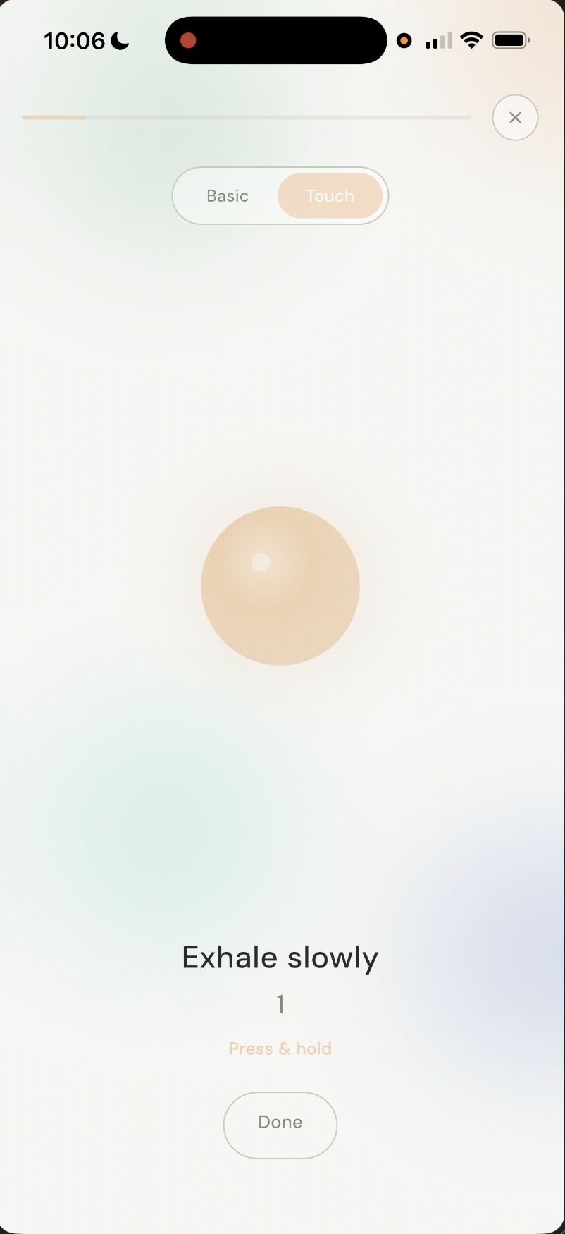
| Breathing | Panic / high arousal | Press + release | Physically anchors breath rhythm; evidence-backed. |
The product avoids both extremes: clinical, which would make the moment feel more serious, and gamified, which would feel patronising.
Low-pressure depth in the prototype screens.
Abstract companion-like presence without a character.
Slow change that gives attention somewhere to rest.
Fewer decisions visible at once.
Supportive tone without medical signalling.
3 device inputs made Figma the wrong evaluation tool. Tilt sensors, microphone input, and touch-controlled breathing needed real behaviour, not clickable frames.
| Stage | Question | What changed |
|---|---|---|
| Low-fi | Does the structure make sense? | Figma screens moved into static Flutter screens for phone-based testing. |
| Mid-fi | Does the experience feel usable and grounding? | Interactive balancing, offloading, breathing, and focus visuals were added. |
n=4, scenario-based, self-reported. The data shows directional perceived state change after using the prototype, not clinical effect.
| Participant | Nervousness Δ | Mental Clutter Δ | Clarity Δ | Readiness Δ |
|---|---|---|---|---|
| User 1 | −5.5 | −8 | +8 | +2 |
| User 2 | −2 | −2 | +3 | +1 |
| User 3 | −3 | −6 | +1 | +1 |
| User 4 | −2.5 | −2 | +5 | +3 |
| Average shift | −3.25 | −4.5 | +4.25 | +1.75 |
The 3.5-point shift is a signal, not a conclusion. — Evidence limit
Reliability is part of trust. — Core technical finding
The challenge was not building four features. It was making them work reliably in the exact moment when failure would hurt most.
Strongest finding: different acute stress states need different interaction responses. The project does not prove anxiety reduction; it shows that single-mode wellness tools are designed for the wrong moment.
| Sample | n=4 across both test stages. |
| Context | Simulated scenario, not a real pre-performance moment. |
| Measures | Self-report only; no HRV, cortisol, or physiological data. |
| Pool | Same participant group across stages; useful for comparison, weak for generalisability. |
Stabilise the tech, then test in real pre-performance contexts with ethical safeguards. The sharper product question is which mode works best for which user state — right now, the app assumes the user knows what they need.